0 Comments
Part 1
1. After watching the video, I feel sad that she has to undergo all these difficulties but also happy that she is proud of the way she is. 2. As a designer, maybe there could be a child/dwarf setting to use simple things like doors or sinks. 3. It is called empathy. Part 2 1. Programmers, engineers, graphic designers 2. Don Norman 3. Electrical Engineering 4. The Design of Everyday Things 5. Discoverability and understanding 6. Implicit understanding of an object's purpose 7. Visual or audible signals that communicate purpose 8. The seven stages of product design 9. "Dumbing down" of user behavior 10. Steve Jobs Part 3 1. Tiktok - notorious for its addictive algorithm, which is very effective in keeping users using the app for hours through almost perfect recommendations 2. Amazon - very easy to navigate and shoppers can always find what they need
 1. Something new I learned was that colors, like people, have their own personalities, and can be used to invoke specific feelings in people.
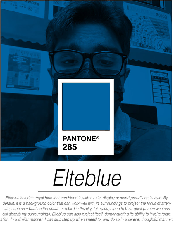
2. I was not surprised that this is my signature color because blue has always been my favorite color as I resonated the most with it. However, this activity taught me exactly why I connected most with blue. 3. A good complimentary color to my signature color would be orange, as blue and orange are opposite to each other in the color wheel. More specifically, Pantone 1505 would compliment Elteblue well. 4. A good analogous color to my signature color would be violet, as blue and violet are next to each other in the color wheel. More specifically, Pantone 2097 C would be a great match. 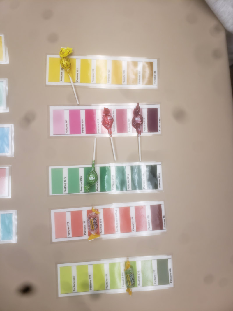 1. It was easy to decipher the colors because all we had to do was match the color of the candy with the correct picture. I think this is how kids learn the different colors.
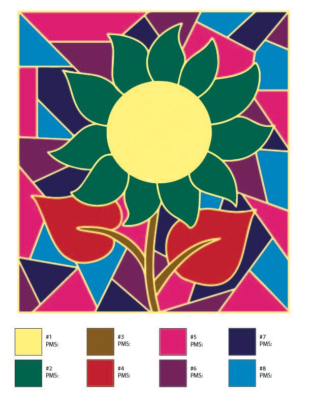
2. The Pantone system is very important for colors to be consistent across all designers in the production process. It is like the metric system as it provides a common language. 3. It would be a good time to use the Pantone system in this class when collaborating within a group. If a certain project were to be split up among teammates, the Pantone system would allow for a more effective divide-and-conquer strategy as common colors are determined and implemented. 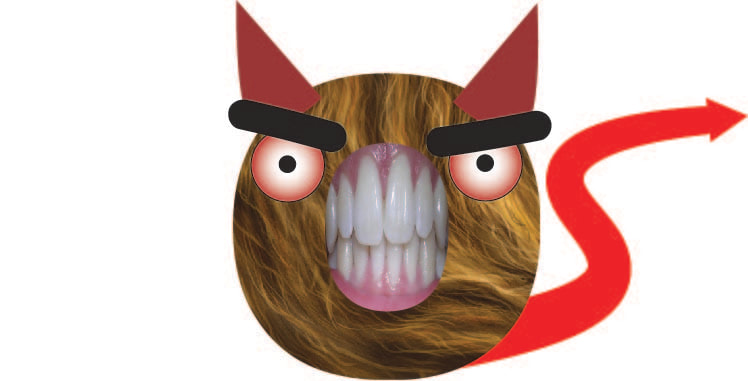 by Satvik Eltepu and Anirud Lappathi
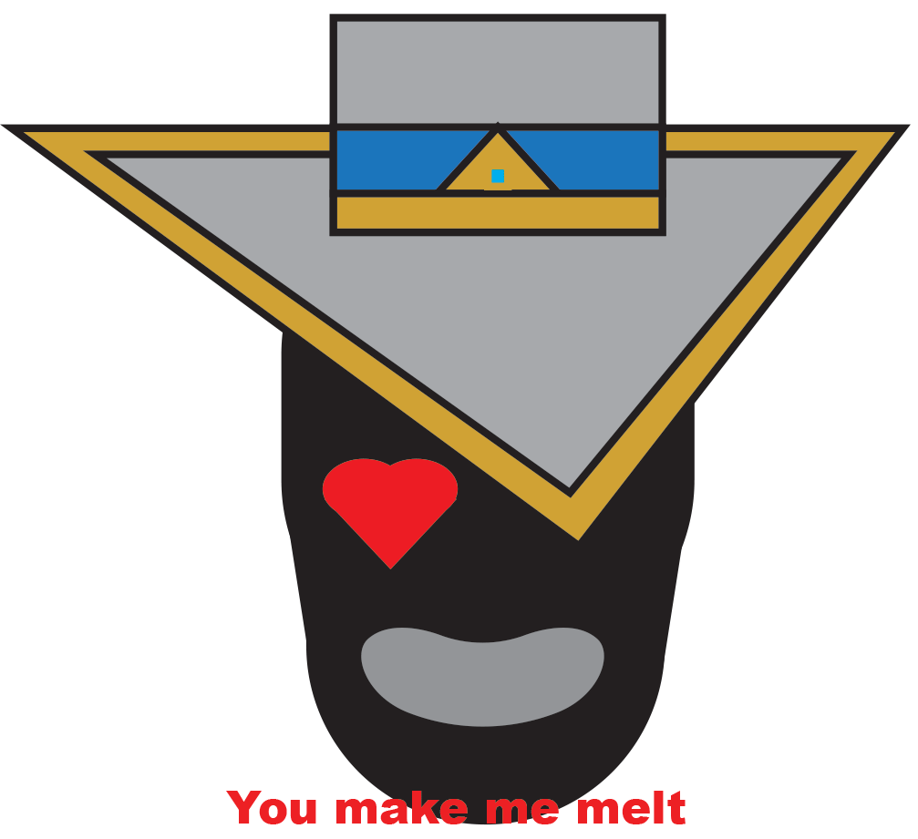
I worked on the features of the monster, such as the eyes, ears, and tail of the monster. Anirud worked on the body of the monster, adding the fur and including a set of human teeth. He also added the eyebrows. 

“Paula Scher.” Pentagram, Pentagram, www.pentagram.com/about/paula-scher.
|
AuthorHi, I'm currently a senior at California High School working towards a computer science major. |
 RSS Feed
